An insurance agency logo template is more than a decorative graphic. It is a starting point for building a visual identity that communicates protection, reliability, professionalism, and the type of insurance service an agency provides. When someone sees an insurance brand for the first time, the logo often becomes one of the quickest visual signals they use to judge whether the organization feels established, approachable, and credible.
Searches for an insurance agency logo template usually reflect several practical needs at once. A new agency may need a starting concept, an established business may want to refresh its identity, and a designer may be collecting references for a client project. The strongest template is therefore not necessarily the most complicated one. It is the design that can be adapted to the agency name, service focus, color system, typography, and communication channels without losing clarity.
Current insurance branding references commonly use shields, umbrellas, rooflines, houses, initials, geometric marks, and restrained typography. These visual conventions work because they quickly suggest protection and stability, but they also create a major branding challenge: many agencies can end up looking alike. A useful template should therefore provide a structural foundation while leaving enough room for distinctive details that separate one agency from another.
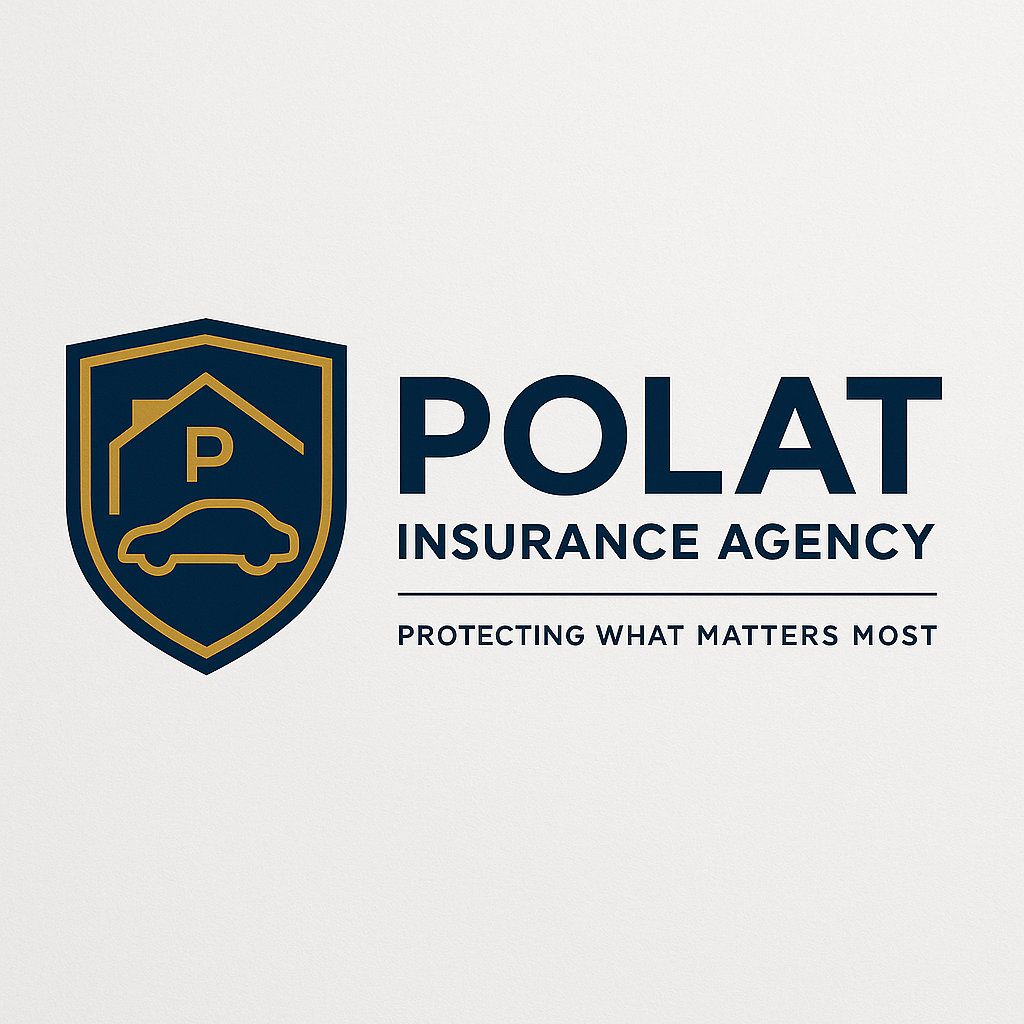
What an Insurance Agency Logo Template Should Accomplish
The central purpose of a logo template is to provide a repeatable visual structure. Instead of beginning with a blank page, the designer starts with an established relationship between symbol, business name, supporting text, and spacing. This can make the creative process faster while still allowing substantial customization. For an insurance agency, that structure should make the organization immediately recognizable without requiring the viewer to interpret an overly abstract symbol.
A useful template should also work at different sizes. An agency logo can appear on a website header, business card, policy document, storefront sign, vehicle, social profile, email signature, presentation, or printed brochure. A design that looks attractive at a large size but becomes unreadable when reduced is not a practical identity system. Simple shapes, strong contrast, and carefully chosen typography generally perform better across these situations.
Another important consideration is visual longevity. Insurance is associated with long-term relationships, policies, protection, and financial decisions, so a logo often benefits from a stable visual language rather than an extremely fashionable treatment. Contemporary styling can still be used, but it should not overwhelm the agency name or make the identity difficult to reproduce several years later.
The best template also establishes a visual hierarchy. The agency name normally deserves the strongest typographic emphasis, while descriptors such as Insurance Agency, Insurance Services, or a short tagline should remain secondary. The symbol should reinforce the identity rather than compete with the name. When all elements have equal visual weight, the logo can become difficult to scan quickly.
Popular Symbols Used in Insurance Logo Design
The shield remains one of the most recognizable visual metaphors for insurance branding. It suggests defense, protection, boundaries, and security without requiring a long explanation. A shield can also be simplified into a geometric shape that remains identifiable at small sizes. For a new agency, this makes a shield-based template a practical starting point, although the designer should customize the internal geometry or typography so the final mark does not look interchangeable with dozens of competitors.
The umbrella is another common symbol because it naturally communicates shelter. It can be used as a literal umbrella, a simplified canopy, or an abstract curved form positioned above a house or wordmark. An umbrella can work particularly well when an agency wants to emphasize broad coverage. However, a literal umbrella may feel generic, so distinctive line work, negative space, proportions, or a custom monogram can help create differentiation.
House and roof symbols are particularly useful for agencies focused on property coverage, homeowners insurance, or combined home and auto services. A roofline can also be abstract enough to represent shelter without looking like a real-estate logo. The same principle applies to car symbols: a simple vehicle silhouette can communicate auto insurance quickly, but excessive detail usually makes the mark harder to reproduce and recognize.

Other useful symbols include hands, check marks, family silhouettes, trees, geometric enclosures, initials, and abstract arcs. These elements can communicate care, completeness, continuity, or support. The strongest choice depends on the agency’s actual positioning. A life insurance specialist may benefit from a family-centered mark, while a commercial brokerage may need a more corporate symbol based on geometry or initials.

Color Choices for an Insurance Agency Logo Template
Color is one of the fastest ways to establish the personality of an insurance brand. Blue is widely associated with professional, corporate, and trustworthy visual identities, which helps explain why it appears frequently in insurance branding. Dark navy can create a serious and established impression, while lighter blue can make the same identity feel more approachable and contemporary.
Green can be useful when the agency wants to suggest growth, stability, health, or a connection with nature. Gold can introduce a premium or established character, especially when paired with navy, black, or deep green. Red can provide strong visibility, but it should be used intentionally because a highly aggressive red treatment may communicate urgency rather than reassurance. Neutral black, white, and gray combinations can be effective when the agency wants a restrained corporate appearance.
Color selection should also account for practical reproduction. A template that depends on subtle gradients may look excellent on a screen but become less flexible in monochrome printing, embroidery, signage, or small-format reproduction. Before selecting a final palette, test the mark against light and dark backgrounds and create a single-color version. If the symbol remains recognizable without color, the underlying design is usually structurally strong.

Color should reinforce the agency’s positioning rather than simply imitate another insurer. A local family agency could use a warmer palette while maintaining professional typography. A commercial brokerage may prefer a restrained navy and gray system. A modern digital-focused insurance company might introduce a brighter accent while keeping the primary mark simple.
Typography and Layout That Build Trust
Typography has a direct effect on how an insurance identity feels. Serif typefaces can suggest tradition, heritage, authority, and established expertise. Sans-serif typefaces often feel cleaner and more contemporary. Neither category is automatically better. The right decision depends on the agency’s market, audience, service mix, and desired personality.
A strong insurance agency logo template usually keeps the number of type treatments limited. A bold primary typeface can identify the agency, while a lighter supporting style can identify the service category. Excessive font variation makes the logo feel less coherent. Letter spacing is also important because insurance names can become visually dense when long words are compressed into a narrow lockup.
Layout should be evaluated in several configurations. A horizontal version is useful for website headers, stationery, and vehicle graphics. A stacked version may work better for social profiles and square placements. A symbol-only version can serve as a compact brand identifier. Creating these variations from the same visual system is preferable to designing unrelated marks for different platforms.

Templates that rely on a monogram can be especially useful for agencies with long names. Initials can be combined into a shield, circle, geometric structure, or abstract mark. The important consideration is legibility: viewers should be able to recognize the agency name from the wordmark even when the symbol is unfamiliar.

Choosing Between Different Template Styles
Emblem templates place the symbol and wording inside a badge, circle, shield, or other contained shape. They can create a traditional and established impression and are particularly suitable for agencies that want a strong seal-like identity. Their main limitation is complexity. When too many words are placed around an emblem, the logo can become difficult to read at small sizes.
Horizontal lockups are often more flexible for everyday business use. They typically place the symbol on one side and the agency name on the other. This arrangement can fit naturally into websites, letterheads, invoices, email signatures, and signage. A horizontal template is a practical choice when the agency expects the name to remain the dominant part of the identity.
Wordmarks remove the symbol and make typography the primary brand device. This approach can be effective when the agency has a distinctive name or wants a refined, understated appearance. A wordmark also avoids some of the visual clichés associated with shields and umbrellas. However, the typography must be distinctive enough to create recognition without relying on a separate icon.
Badge, horizontal, stacked, and wordmark approaches should not be treated as isolated choices. A well-built template can often be adapted into several configurations while preserving the same visual identity. This is one reason editable source material matters: it allows spacing, proportions, colors, and typography to be adjusted rather than forcing the business into one fixed arrangement.

Understanding Common Logo File Formats
People searching for an insurance agency logo template free often focus first on the visual design, but file format can be just as important. A template may look suitable while still being difficult to modify or reproduce. Before selecting one, determine whether the source is intended for editing, print production, digital use, or presentation materials.
An insurance agency logo template download search can also indicate that the reader wants a reusable source file rather than a simple preview image. The key distinction is whether the source contains editable elements. A flat image may allow color changes only through additional editing, while a properly structured vector or layered source can provide much greater control over individual components.
For users specifically searching for an insurance agency logo template word, a Word-compatible format can be convenient for basic business documents and internal materials. It is important, however, to understand the limitations of document-oriented logo editing. A logo intended for professional identity work should ultimately be available in a format that preserves clean shapes and consistent reproduction at different sizes.

An insurance agency logo template free download search can also lead to files with different licensing conditions. The visual preview alone does not establish whether a particular asset can be used commercially. Always review the actual licensing terms attached to the resource before using it for a company identity, advertising campaign, merchandise, or client work.
PNG, PSD, PDF, and Editable Sources
An insurance agency logo template png is generally useful when a transparent raster image is needed for websites, presentations, documents, or digital graphics. PNG is convenient because it can preserve transparency, but it is still a raster format. Enlarging a small raster logo too far can make edges appear soft or pixelated.
An insurance agency logo template psd may be useful when the design is built with separate layers. Layered files can make it easier to modify colors, typography, symbols, and backgrounds, depending on how the source was constructed. The existence of a PSD extension alone does not guarantee that every element is independently editable, so inspect the layer structure before relying on it for a branding project.
An insurance agency logo template editable should ideally allow the core elements to be changed without rebuilding the entire identity. This can include the business name, tagline, colors, symbol proportions, and layout. For professional use, the ability to create horizontal, stacked, monochrome, and symbol-only versions is more valuable than having a large number of decorative effects.

An insurance agency logo template pdf can be useful for print-oriented workflows, proofing, or documents, depending on how the file was produced. A PDF can contain vector artwork, raster elements, or both, so the extension by itself does not determine quality. For long-term brand management, keep an original editable source alongside production-ready versions rather than relying on one exported file.
How to Evaluate Insurance Company Logo Samples
Looking at insurance company logo samples is most useful when the examples are analyzed rather than simply copied. Study how the symbol relates to the company name, how much space surrounds the mark, how many colors are used, and whether the typography remains readable at smaller sizes. This approach turns visual browsing into a practical research method.
When comparing logos for insurance agencies, pay attention to recurring visual patterns. Shields and umbrellas communicate protection quickly, while monograms can create stronger differentiation. House and car symbols immediately communicate specific coverage categories. Wordmarks can feel more sophisticated but require stronger typographic character to become memorable.
Another useful comparison is between literal and abstract symbolism. A literal house is immediately understandable but may look similar to many other property-related brands. An abstract roofline can communicate shelter while providing more room for a unique identity. Similarly, a shield can be customized through proportion, negative space, initials, or internal geometry instead of relying on a generic stock shape.

When reviewing insurance company logo images, also inspect how each identity behaves on light and dark backgrounds. A logo that depends entirely on one background color may be less flexible than one that has clearly defined positive, reversed, and monochrome versions. This matters when the identity must appear across different marketing materials and digital environments.

Insurance Agency Logo Ideas That Avoid Generic Branding
One practical source of insurance agency logo ideas is the agency’s own service structure. Instead of selecting a random shield, identify what the organization actually protects. A home and auto agency might integrate a roofline and vehicle silhouette. A commercial brokerage could use architectural geometry or a strong monogram. A life-focused agency might use a simplified family or protective enclosure.
Another approach is to build a custom visual relationship between an initial and a protection symbol. For example, the first letter of the agency name could become the negative space inside a shield. A roofline could form part of a letter. An umbrella curve could double as a distinctive typographic stroke. These solutions can retain the immediate insurance association while creating a more ownable visual mark.
Geometric abstraction can also help. Instead of drawing a literal shield, use two or three shapes that imply an enclosure, boundary, or protective canopy. This approach can make a new identity feel contemporary without abandoning the category cues that help people understand the business.

Distinctive typography is another opportunity. An agency does not necessarily need an icon if its name can become visually memorable. Customizing one or two letterforms, adjusting spacing, or creating a unique wordmark can produce a strong identity. This can be particularly effective for agencies with short names or unusual initials.

Common Mistakes When Using a Template
The first common mistake is treating a template as a finished brand. A template is a foundation, not automatically a distinctive identity. If the business name is simply inserted into a generic shield without changing the visual character, the result may look interchangeable with other insurance agencies. Customization should happen at the level of proportion, typography, color, symbolism, and spacing.
The second mistake is adding too many symbols. Designers sometimes attempt to represent home, auto, life, health, commercial, travel, and business coverage inside one small emblem. The result can become crowded. A stronger strategy is to select one primary protection idea and let the agency’s supporting text communicate the breadth of services.
The third mistake is ignoring small-size performance. A detailed emblem may look impressive on a large screen but become indistinguishable when placed beside a website navigation bar or printed on a business card. Always test the design at the approximate size where customers will encounter it most often.

Another mistake is choosing colors before defining the brand personality. Color should support the positioning rather than become the entire strategy. A navy shield is not automatically trustworthy, just as a bright color is not automatically modern. The symbol, typography, spacing, and message must work together.

Practical Solution
Start by writing a short design brief before selecting an insurance agency logo template. Record the agency name, primary services, preferred personality, target audience, geographic positioning if relevant, and three qualities the brand should communicate. Examples might include dependable, modern, established, approachable, local, or premium. This short brief becomes the filter for every design decision and prevents attractive but irrelevant templates from taking over the process.
Next, collect several visual directions rather than choosing the first attractive template. Create separate groups for shield-based, umbrella-based, home-and-auto, monogram, and wordmark concepts. Compare them for readability, distinctiveness, reproduction flexibility, and alignment with the agency’s services. At this stage, do not worry about perfect colors or final wording. Concentrate on structure and brand meaning.
Then customize the strongest direction systematically. Replace placeholder text with the actual agency name, adjust the typography, refine the symbol, establish a restrained color palette, and remove unnecessary decorative elements. Produce horizontal, stacked, monochrome, and symbol-only variations. If the identity still works when reduced significantly, it has a much stronger foundation for real-world branding.

After the visual design is established, test it in realistic contexts. Place the mark on a business card, website header, policy document, social profile, vehicle graphic, storefront sign, and presentation cover. The goal is not to create elaborate mockups but to see whether the identity remains clear when surrounded by real content. This step often reveals spacing, contrast, or typography problems that are difficult to notice in an isolated logo.
Finally, maintain a small brand asset system rather than keeping only one final image. Preserve the editable master source and create appropriate production versions for different uses. Keep the official colors, typography rules, clear-space guidance, and approved logo variations documented. This prevents future materials from slowly developing inconsistent versions of the same agency identity.
Reference Examples
An insurance agency logo template is easiest to evaluate when the reader can compare different visual approaches side by side. The examples below show how real insurance identities use shields, monograms, umbrellas, houses, vehicles, badges, and typography to communicate protection. Some emphasize a symbol while others make the agency name dominant. Together, they demonstrate that there is no single correct structure for an insurance identity; the strongest choice depends on the services, personality, and practical environments in which the mark will appear.
These reference examples also illustrate useful differences in color, proportion, symbolism, and typographic hierarchy. When reviewing an insurance agency logo template, look beyond the surface appearance and ask what makes each design recognizable, how easily its central idea can be understood, and whether the mark could remain clear at a small size. The examples can therefore be used as visual research for selecting a direction, identifying patterns to avoid, and developing a more distinctive identity rather than copying another company’s branding.

Life Shield Insurance Logo
Source: Life Shield Insurance

AEGIS General Insurance Agency Logo
Source: Eric L. Ash Agency

PMG Agency Stacked Logo
Source: PMG Agency
Mota Insurance Agency Logo
Source: Mota Insurance Agency
Kerr Agency Insurance Logo
Source: Kerr Agency, Inc.

Remedy Insurance Agency Logo
Source: Remedy Insurance Agency
Simplified Life Insurance Agency Logo
Source: Simplified Life Insurance Agency
DLS Insurance Agency Logo
Source: DLS Insurance Agency, LLC

Ryze Insurance Services Logo
Source: Ryze Insurance Services

Hakola Agency Logo and Tagline
Source: Hakola Agency
